Practice Makes Perfect: An Artist's Journey
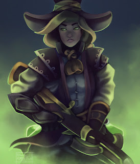
Mia is an artist who frequently shares her digital paintings for Wizard101 and her characters on her Twitter profile. While a long-time Wizard101 player, she is newer to the community, and has found a group of talented wizard artists to swap tips and tricks with. Her impressive progression of work is presented in her overview here, as well as a run-down of her artistic process.
Well hello there! My name is Mia, or DearlyAbby, and or DearlyDoodles. I've been a part of this amazing community for about a year now as well playing Wizard101 since the beginning, just a tad bit late into the art community.
Into the Community
Before getting involved in the community, I was currently floating around on Deviant Art doing my own thing basically. I honestly didn't know at first there was a community or a group on DA dedicated to Wizard101. Personally I wasn't all too great at any kind of human-related drawings, just the basic Disney animals, which looking back at now makes me cringe, haha. I told myself once I hit sophomore year that drawing nothing but animals isn't going to get me far into the art career that I wanted to achieve. So, that's when I went all out studying how to draw more humans, which wasn't exactly too long ago surprisingly.
 I uploaded my first human painting of Abby (My Wizard101 Character) to the W101 DA group; many flaws showed but I was satisfied being my first digital painting. It received many complements which boosted my motivation to take painting full on, which turned out to be a great decision now. Digging deeper into the art community on DA, I met some of my dearest friends - Launie, Avery, Banana, Cuban, Kirsty and last but not least Danny plus many others. Their kindness and support helped me push through rough times, which I feel so grateful for, as well as critiques on how to improve my art work.
Now, when it comes to painting I am pretty much self taught, my teacher was many YouTube videos, haha. Inspirations such as Dave Greco, Kienan Lafferty, Miguel Mercado, Kevin Chin, plus many many more, inspired me to reach out and learn many different ways to take on a painting as well as how to complete it. It's truly important not to stick to one thing, or draw something the same way over and over again; you will put yourself in a tough spot that will be very difficult to climb out of. It won't hurt to experiment with different colors, background studies, or any kinds of studies at all; it will help out big time.
Artistic Process
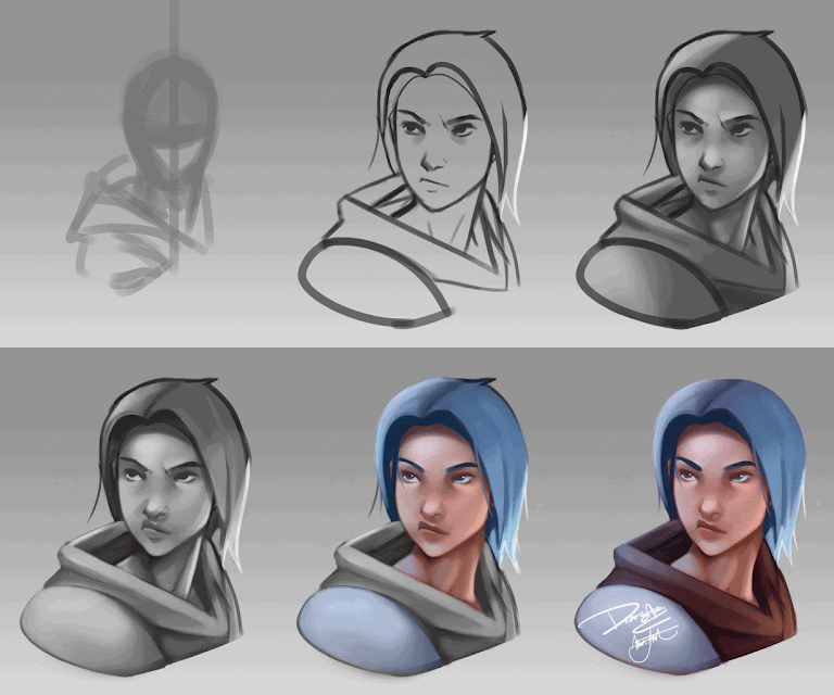
Alrighty, now here comes the fun part! I made a poll on twitter what I should show a tutorial on; shading was the lucky winner. I'll still show how I color as well, because its pretty fun, haha. I'll be using one of my own original characters who still doesn't have a name. I'll take any suggestions, hehe. First off I start of with a quick rough sketch and go off of that like usual. Once I start setting down the base lines it's always useful to flip the canvas horizontally back and forth to get a fresh look on things in case anything looks funny. Once satisfied with the lines, I darken them and throw a base layer underneath to paint the values on top of. Painting with values personally is a lot more fun than just throwing down the main color and shading over top. I guess it just depends on what kind of effect you're going for.
 After the rough shading is there, comes to my favorite part, rendering, ahahah! I find it fun because it's somewhat of a final touch up layer letting you go all out on details. Once that's completed, I merge the layers together and put a gradient overlay on top to make it not seem so dead, just add a bit of life back into it.
Next I add a color layer above the tone layer, you can either use a soft light layer if you like how that looks as well. Then just go all out with the colors! Remember to keep in mind what around your character or object, different environments means different shades of color as well as what time during the day it is. And I can not stress this enough, never, ever, ever, use black or flat out gray to add shading into your colors. It will make your piece look muddy and patchy as well as dead looking, everything has a certain color to it. Either use a dark less saturated color such as purple or blue, depending on your back ground or whats around your character. Just remember not to go too unsaturated making the color seem more gray.
After all that fun, if there are things you would like to touch up you can always overpaint over everything to clean the piece up and seem a tad more rendered. Finally add whatever effects and changes then.... ta da, you're done! I hope that helps someone in some way, hehe.
Overall, this community helped me push out of my comfort zone and helped me improve in my art in many ways. Meeting so many great, creative, and talented people, as well as many others I would like to get to know a lot better, I'll keep my eyes out for more great opportunities such as this one, thank you for having me! I'll be here for a long while, haha.
Guest post by Mia. Thanks for reading and see you in the Spiral!


No comments
Note: Only a member of this blog may post a comment.